Take 5 Art May 2020

Hello Dear,
So I join the monthly Take 5 Art that Kyra started (for a few years now). Each month another lovely artist (besides Kyra there are 11 others!) comes up with the prompts. This month it was Shay with the prompts:
1. An unexpected tool
2. Black and White background
3. Something inspired by your favourite artist
4. Texture elements or texture paste
5. Hidden Message

Basically my mind went "Who is your favourite artist!? Do you think you can point 1 out." Clearly I couldn't... Cause besides the (historical) famous ones, there are so many that share their talents on YouTube with us! Including the ladies who are part of the Take 5 Art prompt group.
A couple of ideas that went through my head:
- Escher has black and white tessellations
- Vermeer, I live in Delft, so that painter is always in the front of my head. For some reason I was thinking of the girl with the pearl earring or the milkmaid as focus point. Also the flag of the city is white, black, white. (I could have chosen Delft Blue as a focus point too, a big blue mill with a black, white (grey) sky).
- Vermeer made me go: Dutch Masters???
- van Gogh. van Gogh is always good, something with the sunflowers. The background of black and white will bring it out even more!
- Dali, I like the guy's weird dreamy stuff.
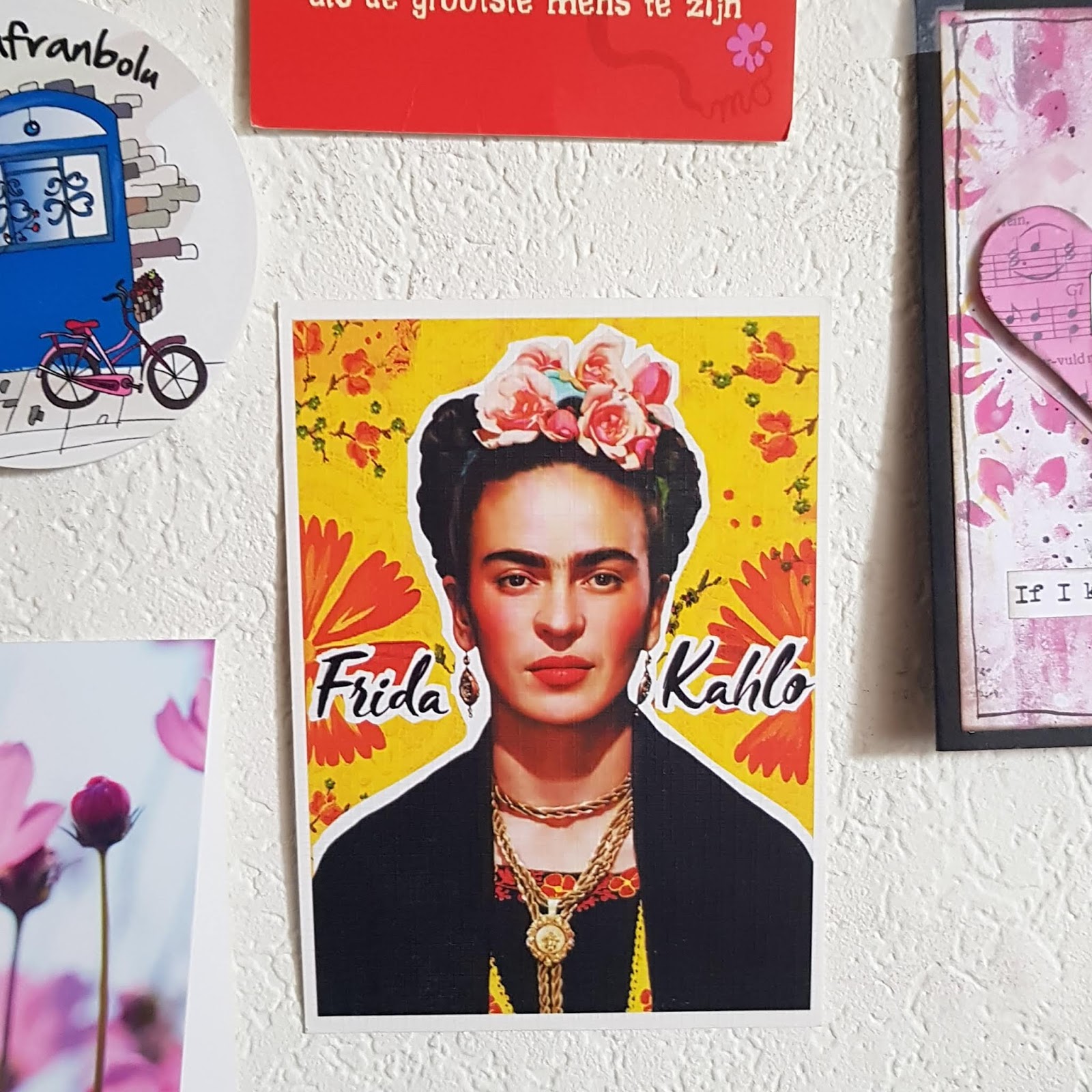
- Frida Kahlo! I mean she is amazing, not just her art, but also her way of thinking in the situation she is in. She'd probably roll her eyes at the world and tell us to stop being such **** and just stay home and paint! Also there is a card on my wall of her.
- Turkish Tile designs...
- I mean even the CoBrA passed my head and I thought Karel Appel! Don't ask me why, I am not a big fan of that style. I get the reasoning behind it, but no, not my style.
So I left the favourite artist part and decided to work on the background first. I still have a few pages in my junk/ art journal Kyra made.
So I picked a page and gessoed it. Both of the other sides have paintings on them and I did not want them to be ruined by it. Also these pages are thin, I mean the atlas page is okay, the other craft paper is thin. (Also the other side I used modeling paste and wet mediums... So it was fragile.)

So first prompt I used is Black and White background. Used the acrylics from Action (Brand: van Bleiswijck) and decided to use horizontal and vertical lines.

Reasoning behind this is, I found an old (art) journal I used this technique with waterpaint to try out... on several pages and I liked how it looked. I like how this look too. I did the while paint first, let it dry and added the black paint on it.

Now the second and third prompt: unexpected tool and texture. The heat tool I used to dry to paint with I used to burn the paint with. That is a technique I looooove to use. Burn the modeling past or the paint. I am not sure what modelling paste is made of, but acrylic paint basically dries and becomes plastic... (I think, to me it does this). And plastic burns and changes. In this case it bubbles and gets a different structure.That is besides the fact that I used layers of acrylic paint and it had texture.

End result:

I left this and went to bed. I could not think anymore... So I slept.
Next day: I asked Anny. She went "Well my favourite is Frida!" I was like "She is one of the choices and she is on the postcard... but isn't also so obvious... It is also easy..." So yeah... Frida Kahlo it was! I used the postcard I got from my penpal Asiye as my focus.
The lovely Marcia (go check out her gorgeous girls) made a face template for me and I use it for pretty much EVERYTHING! So the base of this face is from her.
I drew out what I thought looked like Frida: the eyebrows, the braids.

Used a waterproof pigment liner.

Took out the Art Creation watercolour box (I have had this for more than 2 years!!! and the only colour I don't have in it anymore is the dark blue. I do have another box, they were on sale in Xenos, I got extras! but I haven't opened that one).

Slowly added the colours on her face.

Made sure the braids were still visible when I painted it. The "black" is actually a dark grey (Payne's Grey) so it is not really very dark.

Her shirt needed a bit of colour. The yellow and red was on the card, so I used those colours. The green is watercolour and if I added red to it, it would bleed and look weird. So I took a red Sharpie to draw some flowers and the black tombow to add a stripe in the middle of her dress (See the difference between that and the paint?)

When she was finished I cut her out and wondered what to use for flowers. I know I have paper, fabric and plastic flowers I can use. So I took them all out. To be honest I thought I'd use the little paper roses.

But I found some pink fabric (ribbon) roses. I think I used them to do something for my brother's wedding, I remember buying them for that reason. Anyway, don't they look perfect to put on our Frida.

I didn't want to use glue, cause it tends to get messy. Even if you use fabric glue, so I used a needle and thread.

This is how it ended up, I really sewed them up in the paper.

Put it against the background and groaned. She didn't pop out, the background basically sucked her in. I thought it needed more colour... Except... How...

But guess what else was in the bag of flowers!? These gorgeous leavy ribbon. Also they reminded me of her Roots painting.

So I stuck them with glue to the paper in a way I like them. I am not sure if it was smart to use glue, but I can always put some medium gel on it. Didn't glue her yet...

For the empty space I decided to use a quote by her. I wrote it on some of the "left over" paper. Each word got a border, just cause I like it and also end up doing it later anyway.

They do look good when you cut them out.

I realized I forgot Frida's golden earrings and necklace. Used brads for them.

Which ended up looking pretty good, so I stuck her to the page.

To add the chains to the necklace I decided to use gold paint. Also I added some gold splatter to the background, just cause I like how it ends up looking.

Now my last prompt: Secret message... My god, that was another thing that made me cringe. I had nooo clue what and where. I asked Anny, she told me to add more flowers and leaves. (NO, the journal is already falling apart cause it has so much paper added to it... *wink wink*)

Had the idea to add the words: "You are doing okay" to it. Very fitting to the quote, but also how I feel about being in the situation I am right now. Good moments, bad moments... but I am enduring it. I am okay. Now... Writing on very thin fabric is... A challenge. I used the black pen, it disappeared,used white posca pen... couldn't read it, so I added the black back on top of that again!

Can you read it?

I was still missing something and decided to add a red border around the page. Why red, well cause her lips are red and she did use red a lot! Also red is my fav and I was missing it.

I ended up using the heat tool for the red paint as well and yes, it did get bubbly too, I did however had to be careful not to burn the fabric. (which I am sure is polyester, it started to shrink...)

The end result:

Would love to hear what you thought of it ;)
Also thank you Shay! This page took me longer than any other Take 5 Art page, was more challenging than any page I did and it turned out awesome! Thank you!
Remember, stay home, endure now and enjoy later.
Love, Seher Tuba,


Even though I was chatting to you while you were doing this, there is a lot that I didn't realise about this picture as you were doing it. For example - the fact that you sewed the flowers on. That's so cool.
ReplyDeleteI love what you did, I'm really impressed with all your girls in your journal. I hope you're proud of yourself, because you've done a great job. *hugs*